Adding a chart to an SSRS report
I have added a graph to the top 100 customers report in AX2012 and it already has the percentage field on the report. I had thought that it would be just a case of referencing that field and then creating a chart. While this might be possible in the end I modified the DP class to do the calculation AX side.
Firstly you will need to open the report design in Visual studio:

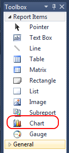
I have decided to add this graph in the body of the report. In the tool box we now have the graph tool:
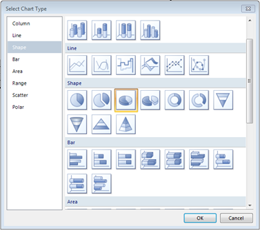
When you place the object you will be greeted by the wizard, where you can select your chart type.
After sizing the graph area you have 3 areas to set the values used in the graph
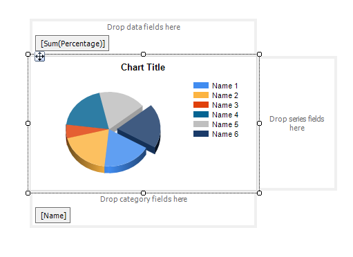
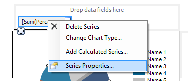
To the top you have the fields that are used to calculate the values i.e. the y values in a bar chart. Please note that you can use aggregate functions and calculations. If you right click on the grey box around the data field you can select series properties and that brings up the advanced properties including the expression builder.
The category fields are the grouping of the data, i.e. the x values in a bar chart. The series fields would be subgroups within the category.
The individual elements that build the chart are controlled as per other elements in SSRS reports and can be moved around:
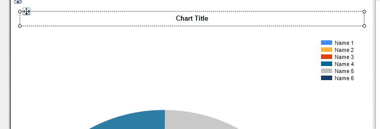
They can also have all of the standard hidden expressions etc.
